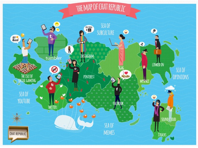
 Here’s something that’s being used to promote the Round Table discussion around Chat Republic.
Make what you will of those floating around the ‘sea of memes’ and ‘sea of opinions.’
Image, courtesy Bates Strategic Alliance
Here’s something that’s being used to promote the Round Table discussion around Chat Republic.
Make what you will of those floating around the ‘sea of memes’ and ‘sea of opinions.’
Image, courtesy Bates Strategic Alliance
I thought I loved info-graphics, until they were run over my marketing people.
Seriously. I used to find the art of info-graphics irresistible long before we they grew like weeds, online. The people who wee good at it were illustrators who worked for newspapers. Some complex heist, or a catastrophic event would be nicely compressed into an info-graphic in a newspaper.
 Now there are so many info-graphics, I found this infographc about infographics!
But what exactly is an info-graphic?
It is usually used as a synonym of Data Visualization. But is it? The simple definition of DV is that it tells a story using data points. But it need not be a ‘graphic’ per se. It could be a dynamic time line, such as the Time Line produced by the Guardian, London. They created what seems like a nice graphic of the incidents of rioting in London in August. But it contains a slider that allows the reader to move through the days from 6th August onward, as towns from Tottenham to Ealing to… Liverpool reported incidents.
 Here’s what it looks like. Click on image to launch visualization.

Contrast this to an Info-graphic, Big Brothers, about satellites that countries from Mexico to Pakistan to Iran have sent up.
To me the best info-graphic does these five things:
 It provides direction, and relationships of where that direction might take you. The simplest info-graphic for me is the compass. I do not need to know the ‘degree’ of the direction, as long as I have the four data points. The best known inf-graphic in this category is the London Underground map.
“Infographics are difficult to define precisely because of their multiple and flexible nature….an information graphic is an aid to thinking and understanding.
I am working on an article on just this topic. So if you have some examples -the good, the bad, the completely distorted– please leave a comment here or send me a tweet.
I will leave you with a great resource by Aaron Weyenberg. His post, “How to distort data” looks at the dangers that lie here.
