 A colleague sent me this link from an NPR Science Friday story. It’s a story based on the voting pattern as seen through cartograms -maps that have been ‘density equalized’ by Michael Gastner and Mark Newman at the University of Michigan.
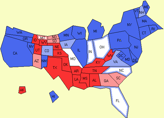
Being in the business of scientific visualization at the Decision Theater it’s fascinating to see science take a crack at politics, and why the red-state, blue-state concept trivializes the voting pattern.
 The TV news networks, of course love the red-blue metaphor. We saw CNN‘s use of the ‘magic wall’ which was a recent creation by a company called Perceptive Pixel (it sold similar walls to ABC and Fox). MSNBC set up a 3D studio for some similar visual treats. CNN even played with teleporting, having the anchor interview a hologram, pushing visualization up several notches.
But NPR’s story is a great way to do a visual post-mortem of how the country voted. While holograms are just eye-candy, cartograms give a better picture of what happened. Gastner, by the way, lets you use his cartogram code, here, where there are more maps of the voting pattern. Talk about seeing things diffferently!
 The dominant metaphor in the book is the US consulate in Istanbul that was built so secure, it’s a place where “birds don’t fly.”
 As I made my short list of whom to vote for in my district & county, I struck out a few people for the simple reason that they have come off so negative. I get it. Negative ads move the needle a bit, but not where I come from.