Creative visualizing of data

We just had a group at the Decision Theater inquiring how our visualizations, which are being linked to data sets, could be used in a Creative way. Creative with the capital C, that is.

So I am thrilled to promote a cool new interface launched today yesterday at Arizona State University’s Global Institute of Sustainability.

It’s called the Campus Metabolism project. Specifically, a web-based tool (a richer experience than Dashboard) for displaying real-time energy use in several buildings across the Tempe campus.

For anyone managing gobs of data and has a hard time getting it to mean something, this is cutting edge. What’s most interesting is that the Campus Metabolism concept was created as a student project – A bottom-up process, if you will. Also, this is the kind of data that makes people feel a real connection to how we relate to the network, the grid, the eco-system. It was initiated with the purpose of looking at “the hidden connection between the impact of the actions in our daily lives and the natural world.”

Sidebar: The folks behind it:
Campus Metabolism brings out the collaborative force behind the work going at at the Global Institute of Sustainability. This one nvolved: ASU Facilities Management, The National Center of Excellence on SMART Innovations, University Student Initiatives, Barrett Honors College, University Architects Office, College of Design, Ira A. Fulton School of Engineering, Psychology, the student chapter of Engineers Without Borders, and APS Energy Services.

Read more about the project here.

Big picture thinking, why is it so hard?

I was at a meeting yesterday morning where the discussion soon turned to how easy it is to look at a report or a set of charts and come to a ‘small picture’ conclusion.

We create models –the mathematical, 2D and 3D kind– here at the Decision Theater for clients that project out 20 or 30 years. But even as ‘big’ as this is in the big picture scheme of things, people easily run off with slices of this information just because it suits their agenda or world view. Water scarcity, a big picture scenario, doesn’t look so bad if you make certain small picture assumptions.

To come at this from a completely different angle,  Al Ries put it bluntly saying “No computer is as smart as a human being with a holistic point of view.” Ries, a marketing expert, was talking about “holism” and applying the need for holistic marketing thinking.

He asks why mathematicians and scientists “who developed the art and science of risk management” built models that could “comb through complicated mortgage portfolios to analyze everything,” and still been so off the mark. (A number that involves 7 and 11 zeroes, to wit!)

The answer, of course, is that they looked at risk up close, but not from a holistic, interconnected perspective.

The same goes for water, transportation, education, health. I like to tell people when presenting big picture concepts in the Drum, that even though we put things into nice buckets, we need to pay attention to the connections. Education planning involves transportation and urban growth –where would teachers live, how far will students travel, how many buses need to be in the school system?

Yes we do zoom in, move slider bars, tweak demand and supply. But we make sure people don’t undervalue the need to zoom out.

Dell’s green road trip bristling with social media

Dell is no newbie to new media. I have been tracking them for more than two years, especially Lionel Menchaca’s parlay into social media with the hugely popular DirectToDell, its attention to the blogosphere, its presence in Second Life, the new Digital Nomads effort, and even the use of Twitter for marketing Dell Outlet,

So when I heard Dell’s latest social media effort, a 15-day, 15-city sustainability road trip with non-profit group Grist was headed to ASU and stopping right here at the Decision Theater, it sounded like a program worth writing about myself. On Friday, Todd Dwyer, Dell’s Environmental blogger, came by with Sarah van Schagen, an editor for Grist.

The reason for the visit was to look at ASU’s role in sustainability, with the School of Sustainability, and our work with the Global Institute of Sustainability.

The ReGeneration blog has some interesting features, steeped in social media. There is the grafitti wall, exploiting web 2.0 to get visitors to contribute to contribute ideas to the site. Videos are posted to Quik, and there’s a graffiti art contest with entries like the one on the left.

They have two posts, and two videos worth checking out.

The rest of the road trip is worth following, too!

Tipping points, “drill baby drill,” and journalism

At the Sustainability Summit today, outside of the lofty discussions around  tipping points (are we there yet?), coalitions (enough tossing bombs at each other), and sustainability was the need for leadership.

As I speculated yesterday, there was an open call for those in the media to drive this train. To up the ante in a different way –explaining to consumers what the policy alternatives mean to them. To bring some clarity. Ah! Media leadership. Not exactly out of the ambit of an industry previously accused of ‘agenda setting.’

A telling quote from the session about the message we need to spread:

“Drill, baby drill” should include “change, baby change!”

Cut to the chase with visualization

Despite what your position may be on Shell, you have to admit it invests a lot on visualizing the energy future –“more energy, less carbon dioxide”–it is grappling with, for good or ill. This is the stuff that gets churned out in white papers, and high-brow academic gatherings, but doesn’t often trickle down to the hoi polloi. We know by now that spreadsheets and PPT decks make people’s eyes glaze over..

In Shell’s 2050, post-Kyoto energy scenario, the visualization lets you pick a year from 2015 through 2050, and look at several factors that come into play in a planet that will be home to 9.5 billion in 2050; the ‘picture’ looks grim/complicated, even from within the cheerful graphics. It makes you want to do something whether it is to invest in fuel cells or reduce your carbon footprint.

Visualization is that great lens that puts data in context, and moves us to take action, even if it starts off with clicking a button. It can be as simple as being a dynamic feed. Check WorldoMeters.info. The speed at which you ‘see’ top-soil erosion taking place, and ‘dollars spent on dieting in the USA’ will give you a jolt!

We use similar, but more complex visualization tools to create scenarios like this at the Decision Theater. The most interesting one, WaterSim, lets people simulate a drought and see the effects on agriculture and lifestyle choices. The challenge is to take this complexity that works well in our immersive environment (the ‘drum’) and render it in a webified environment.

Looking around at so many data-rich web sites, I could see why many sites are begging to be rendered with more visualization. Those of us writing or designing data sheets and white papers will have to recognize some hard realities:

  • New platforms. People will use new devices and platforms to interact with our information via small screens, on high-res devices, and those capable of and hungry for animation.
  • Audience habits: Readers will demand to ‘snack’ on information, before they dig deep. Will our web pages and PDF’s cut to the chase? What’s a ‘media snack?” Check this out.
  • Time shifting. Information might be accessed (downloaded, snacked on) via one platform, consumed on another. Will the visual appeal transfer? Quality isn’t the issue, but compatibility. CNN stories watched on a high-def monitor still transfer to grainy formats on YouTube.

Visualization poses many challenges, but they are grood ones, because they force us to distil information, and give it more context.

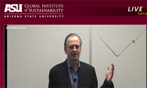
Live streaming on BitGravity

I am watching a live feed of a lecture we are streaming via a provider called BitGravity. It’s an amazing, out-of-the box feature.

The video is very stable, and there’s no lag time on audio.

The speaker is Jay Hakes, Dir. of the Jimmy Carter Presidential Library and Museum and former head of the Energy Information Administration at the U.S. Department of Energy. His book, on the same subject

The topic is fascinating: “A Declaration of Energy Independence.”

This is the link for anyone interested.

Communicating through chaos: What could a pandemic flu teach us

Very happy to be able to break the story about a pandemic flu exercise we conducted here at the Decision Theater at ASU.

It was an exercise that worked on several levels:

  • Strategic Planning
  • Testing Scenarios
  • Communicating with multiple groups
  • Testing a plan through systems dynamic model

I am in the Communications business, so I was keenly observing how different players interacted, assumed leadership positions, and communicated from within the ‘crisis.’

I was lucky to be the fly on the wall (the camera-toting fly, that is) so it got me thinking of the parallels there were for businesses. How do organizations communicate and act in a crisis? As in any marketing campaign or business crisis, the war room is staffed by team members who are are suddenly confronted with the need to operate without the usual props. They may have Blackberries, but the information is coming at them fast and furious through other channels. They may have strong opinions, but so too do the people across the table.

Then there was the interesting irony of some having too much information (mock TV news updates, threat levels, a web cam feed, fact sheets etc) on one side of the room, and others deprived of the usual sources of information (CNN, RSS feeds, radio etc) –all this according to plan. We hosted this event in two areas. Emergency Ops was situated in the ‘drum’ -the high-tech room with a 260-degree panoramic screen, laptops etc. Incident Command and the Executive Policy Group were situated in an adjacent conference room, tethered to the drum via a live camera feed and a land line. No cell phone communication was allowed between the rooms.

Communicators often face situations like this, albeit not in the same life-threatening context. How does a team of those representing PR, Marketing, Advertising, Web Design, HR, IT and Legal Affairs work in crisis mode, in a compressed time frame, when they barely talk to each other in normal life? We seldom act out scenarios, assuming bad things won’t happen to us. History tells us otherwise.

Unless we plan for these hypothetical ‘pandemic’ events we won’t really know. That’s the deeper meaning of strategic planning, isn’t it?

My Social Bookmarking project

In the last two weeks I have been adding Del.icio.us tags at a rapid clip for my work at ASU’s Decision Theater. The initial purpose was selfish. I read a lot, and access content at a variety of locations –a laptop at work, at the library, at home, and very often at someone else’s workstation. I have grown tired of telling people to “send me a link to that article.” Tired because people sometimes forget, which then means a lot of back and forth emails etc.

Social bookmarking solves a lot if this. The quick easy was would be for me use and encourage other communicators across our four campuses to use my delicious tag “decisiontheater” when they see something. (Yes they could use others like Newsvine, StumbleUpon, Redditt and Technorati etc.) That way it shows up when I login to Delicious from any location, and I don’t have to look up different lists of Favorites on different browsers. Reciprocally, I have been asking colleagues to tell me what tag they use, so that I too could be their eyes and ears, and create social bookmarks for their school, business unit, faculty etc.

There are other movements attempting to formalize the business of link-sharing. Publish2 is one of them. It’s mission is:

“to bring all of the world’s journalists onto one common web platform and community, one that empowers journalists to discover, organize, and rank the most important news — to benefit your own reporting, your newsroom, and all news consumers on the web.”

The project is still in beta, and it will be more than Digg or Delicious. I like the crowdsourcing flavor it brings. Which is what my mini project is all about –tapping into the wisdom of the ASU Communication crowd, so to speak.

Visualization meets communication – my new job

A new phase of my career kicked in this week at ASU. I’ve joined the Decision Theater. A perfect fit for my deep interest in technology and collaborative media.

Excuse the brochure-speak, but if you’ve never stepped into an “immersive environment” on the edge of information technology this is it. The thing that strikes me is how useful it would be to apply this blend of informatics and visualization to other disciplines. Marketers and analysts who value pattern recognition will relate to this high end visualization.

If you’ve dabbled in database mismanagement, you know that spreadsheets and bar charts in spiral-bound books don’t quite set people’s heartbeats racing. Which would you prefer: reading a 90-page document on the ‘water atlas’ or moving a slider to see what happens to the community when reservoir levels dip? Data in 3D, and information presented as alternative scenarios make us want to do something, because we don’t live in one dimensional worlds.

Speaking of which, there was a lot of talk in the last year that the web as we know it is quietly gravitating to a “3D web.” For now it’s a visually interactive web, but the visualization part is making quantum leaps.

Let me know if you would like to see what the future of decision making looks like.